In this lecture, we provide a high-level overview of creating and managing charts in Excel (including a brief section on integration with PowerPoint)
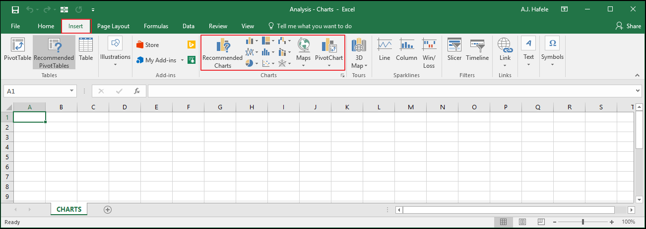
Buttons
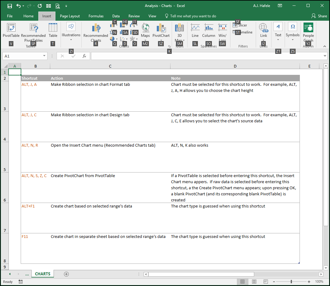
The relevant buttons can be found in the Charts group of the Insert tab:
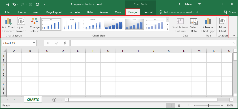
When a chart is created and selected, the Design and Format tabs (for charts) become available
Here is the Design tab:
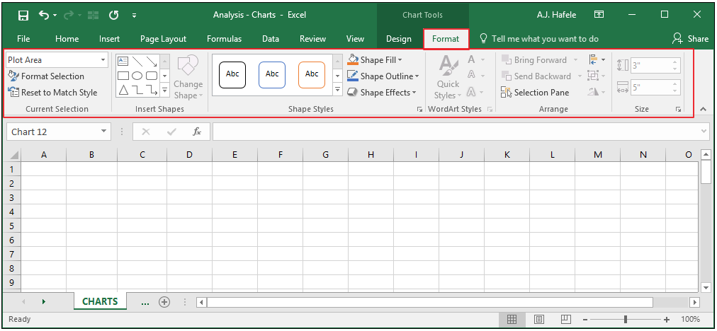
Here is the Format tab:
As you can see, there are a lot of options available to customize your charts as desired
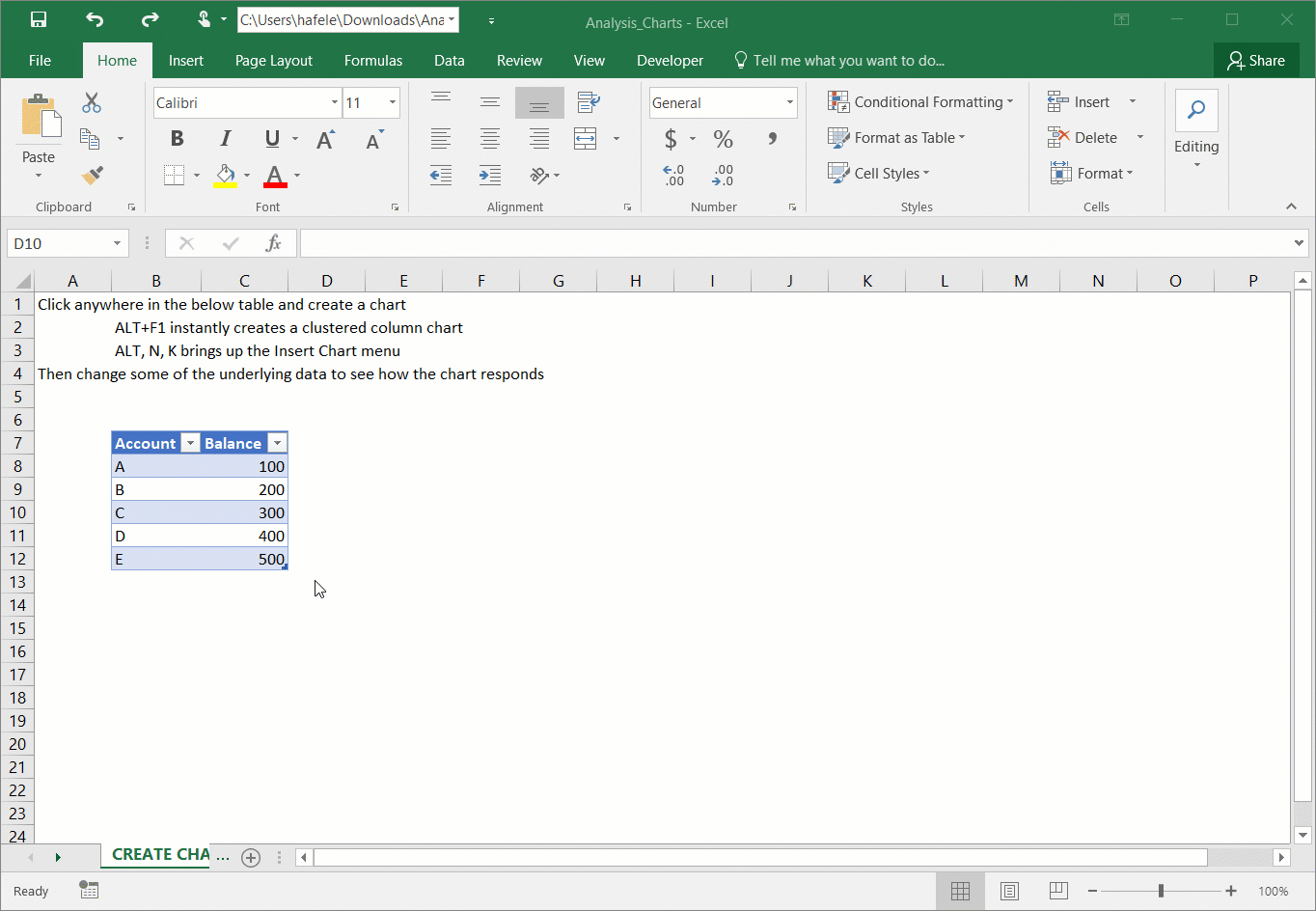
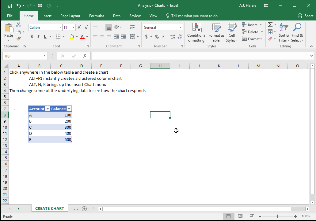
Create a Chart
There are numerous ways to create charts in Excel - let's quickly review two ways
First, let's insert a clustered column chart by first selecting the table of underlying data, and then pressing ALT+F1:
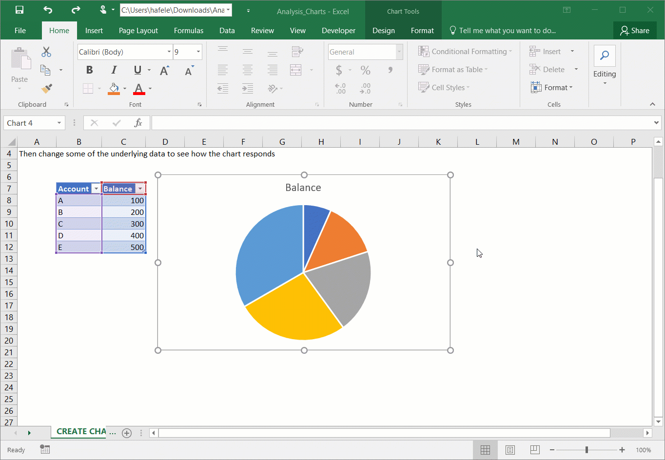
Notice how the chart updates instantly when the underlying data are updated!
Second, let's select a pie chart via the Insert Chart menu (ALT, N, K):
There are more ways to insert charts, so feel free to examine and experiment with the buttons in the Charts group in the Insert tab
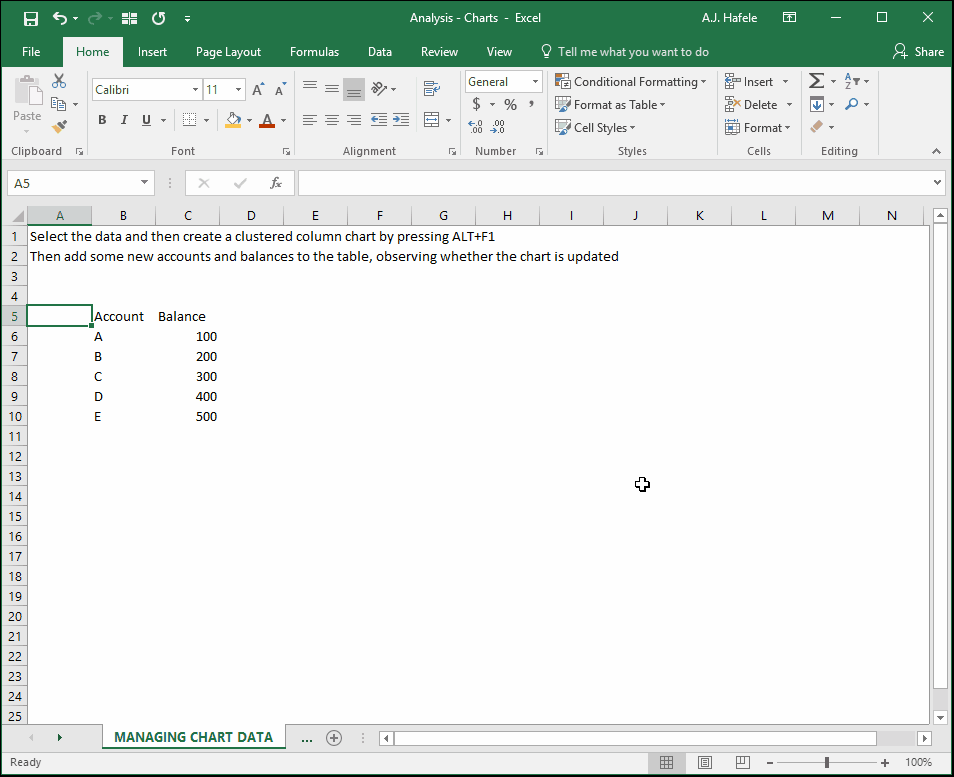
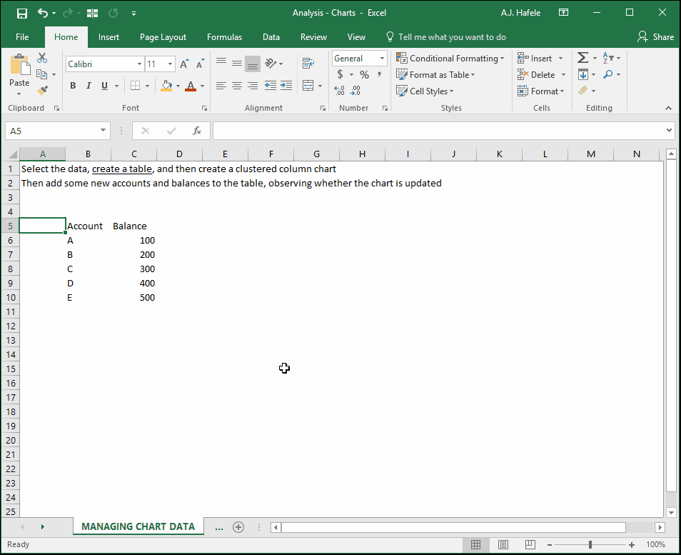
Managing Chart Data (Use Tables!)
As with other functionalities in Excel, charts are best managed when the data are placed in a table
If the data are in a non-table range, the risk is that newly-added data are not reflected in the chart
The following illustration highlights this risk:
Notice that the new data (F and G) were not reflected in the chart
This is because the chart’s data range did not dynamically update to capture the new line items
The good news is that this is not an issue when tables are used, as shown here:
As a result of the data being in a table, accounts F and G were dynamically reflected in the chart
Likewise, if any data are removed from the table, the chart will automatically update reflect those removals
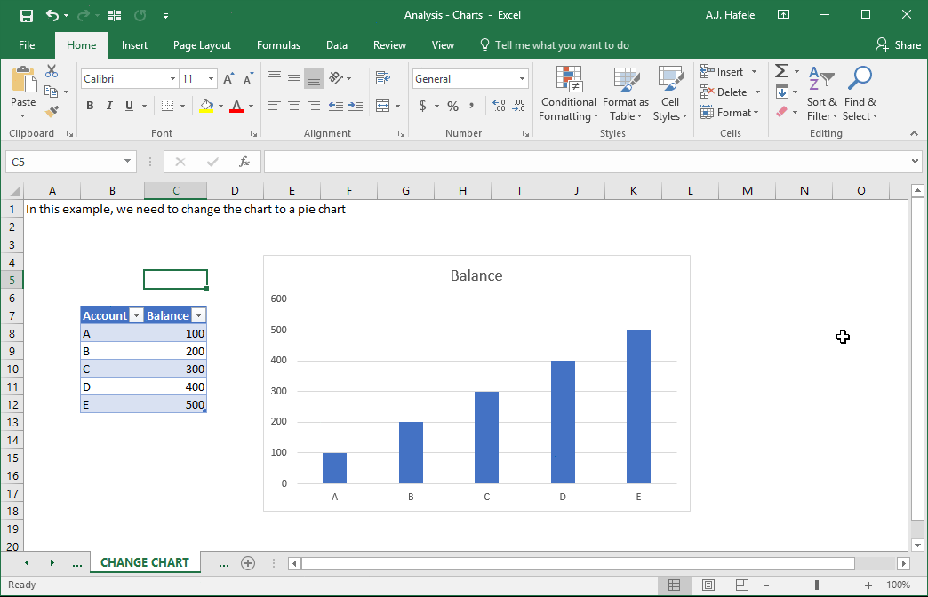
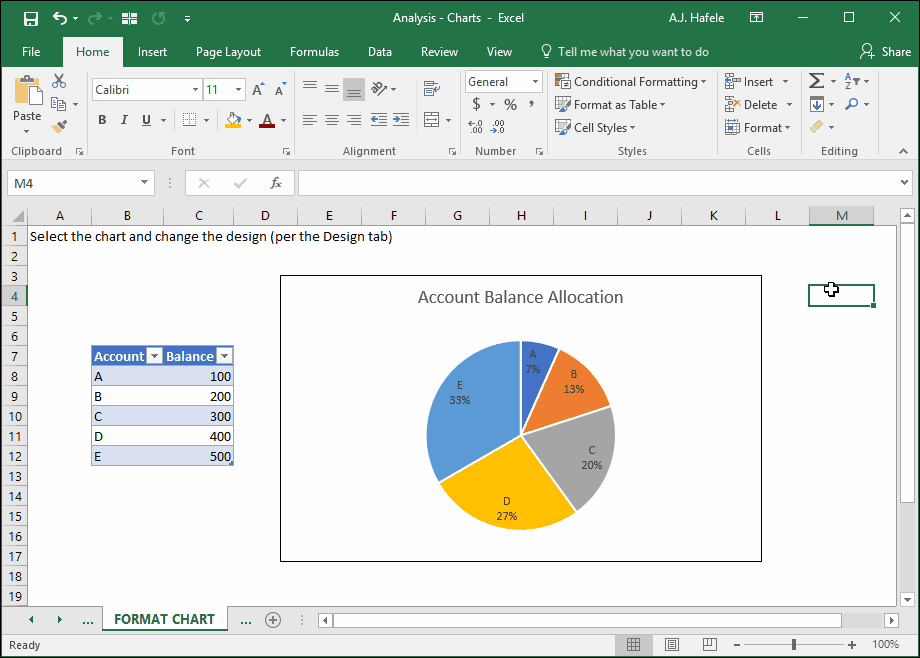
Change Chart Type
Sometimes the chart you are currently using does not properly reflect the message you need to convey
To change a chart type, first select the chart, navigate to the Design tab, and click the “Change Chart Type” button, as shown here:
Use your judgement to decide which chart best conveys the information in question
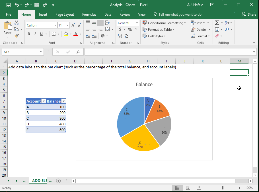
Add Chart Elements (Data Labels, Axis Titles, Legends, Etc.)
In the next illustration, we will add some labels to our pie chart:
The chart label is linked to cell C7 (the header labeled Balance), but we can override with our own chart label, as shown here:
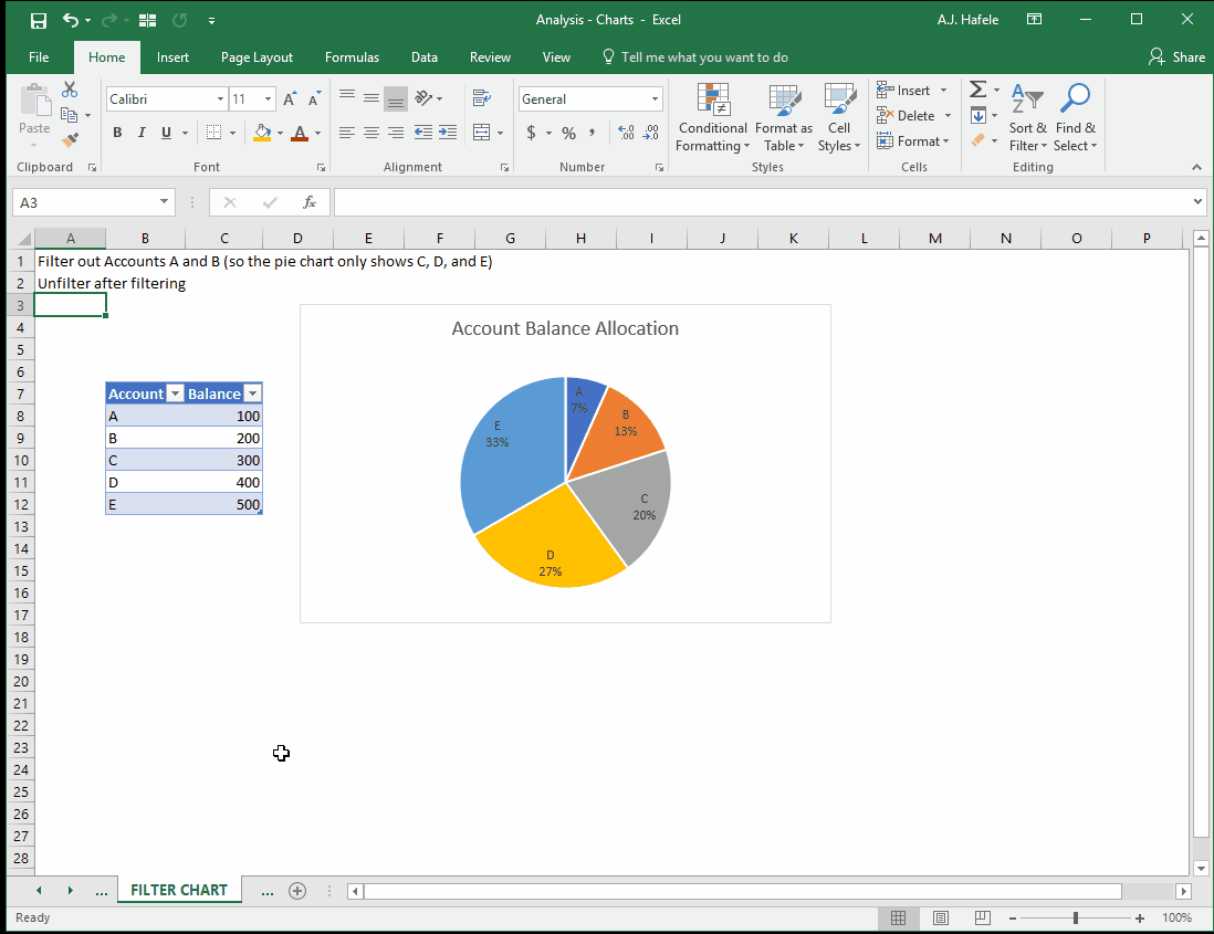
Filter Chart
To quickly filter a chart, simply filter the underlying table, as shown here:
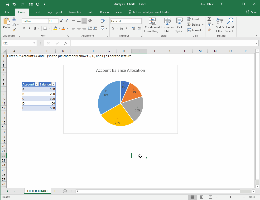
Additionally, later versions of Excel allow you to filter within charts, as shown here:
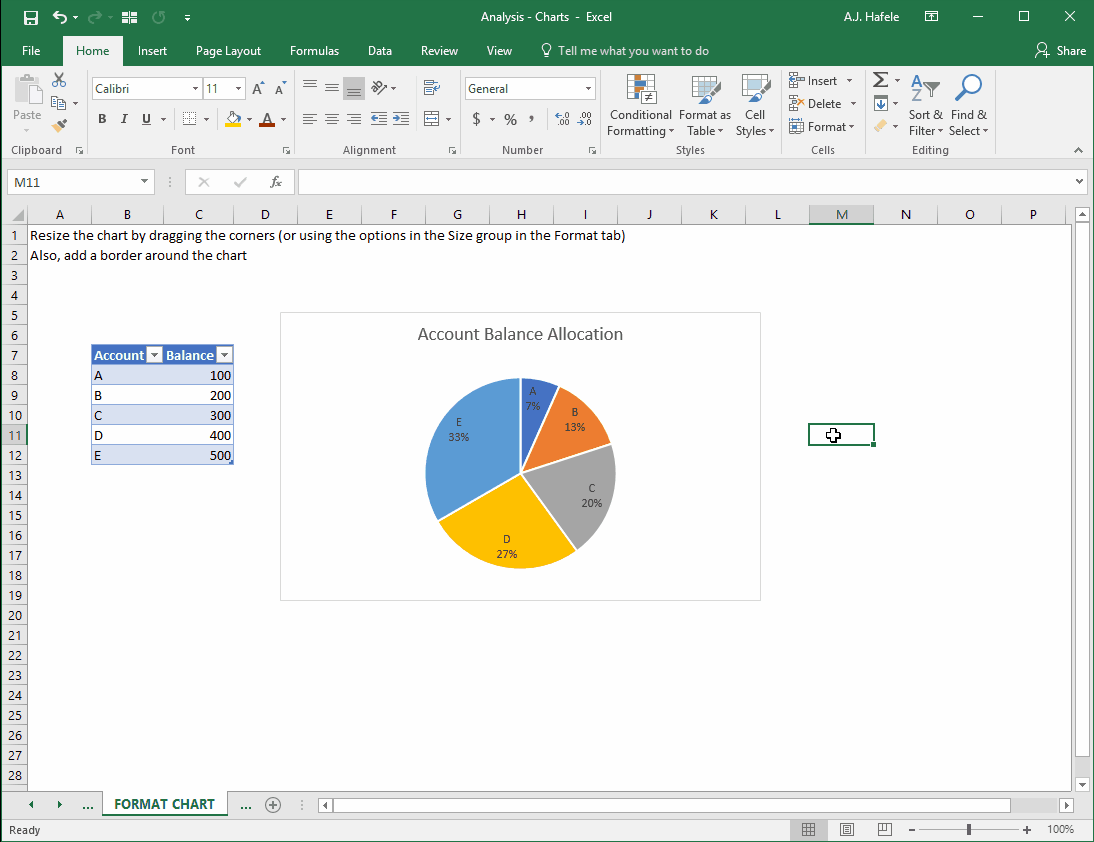
Format Chart
There are many formatting options for charts. Let’s quickly illustrate by resizing the chart and adding a border:
Note that Excel has number of very nice chart templates to choose from, as shown here:
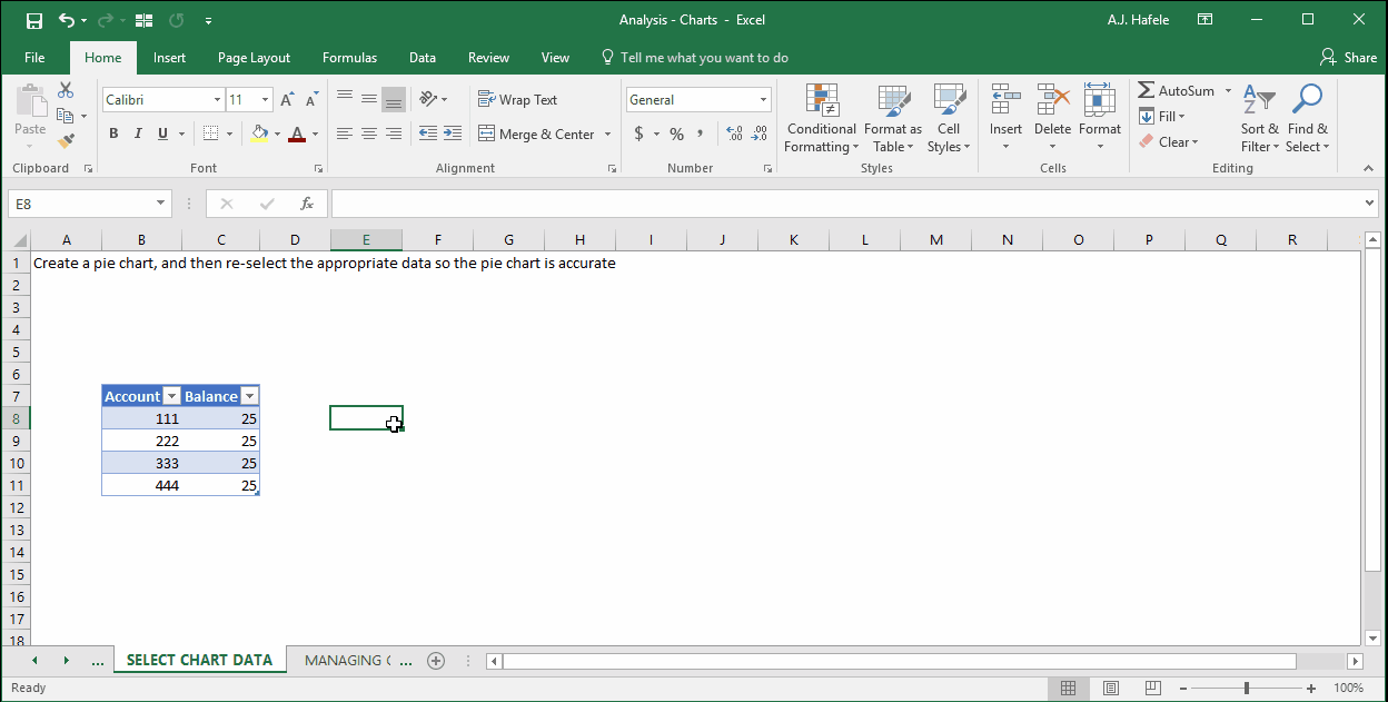
Select Chart Data
When first creating a chart, Excel will guess which data ranges should be charted
Sometimes, however, Excel guesses incorrectly
This requires that the source data be changed
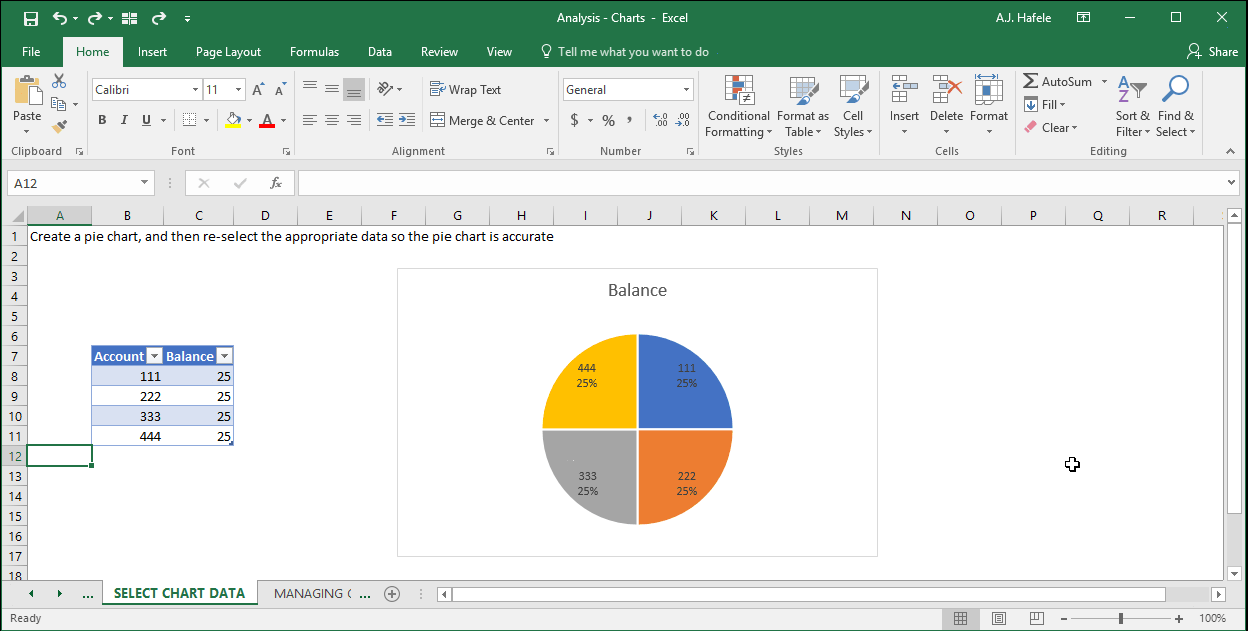
In the following example, Excel initially (and incorrectly) charts the account numbers (111, 222, 333, and 444) rather than the balances (25 each). The pie chart should be split into 4 even pieces
Observe how we can correct this by changing the source data:
Since the data are in a table, if we add a new account (555) and balance (25), the chart automatically accommodates for the change! Observe:
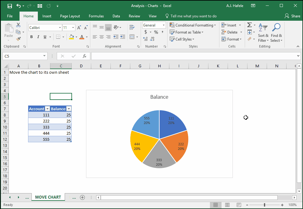
Move Chart
You may prefer to see the chart in another location within the workbook (i.e. in another sheet, or in a sheet of its own)
Let’s illustrate how to move a chart to its own sheet:
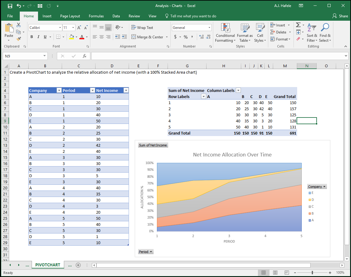
PivotCharts
PivotCharts work very similar to normal charts, except the charts are based on a PivotTable, rather than a range or table of data
The structure of the PivotTable therefore dictates how the PivotChart will look
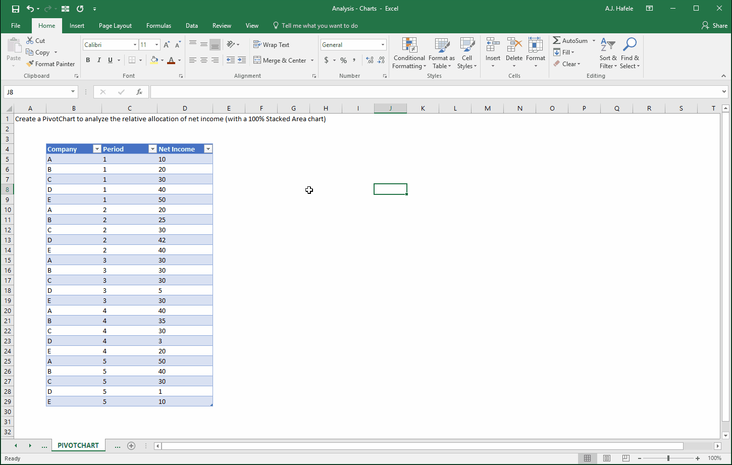
In the next example, we want to observe the percentage allocation of net income of 5 companies that make up an industry
Moreover, we want to compare the allocation over time (5 periods) to see how the market share within the industry changes
Let’s set up the PivotChart (in this example, we will place everything in the same sheet, but this is probably too messy in a real-world situation):
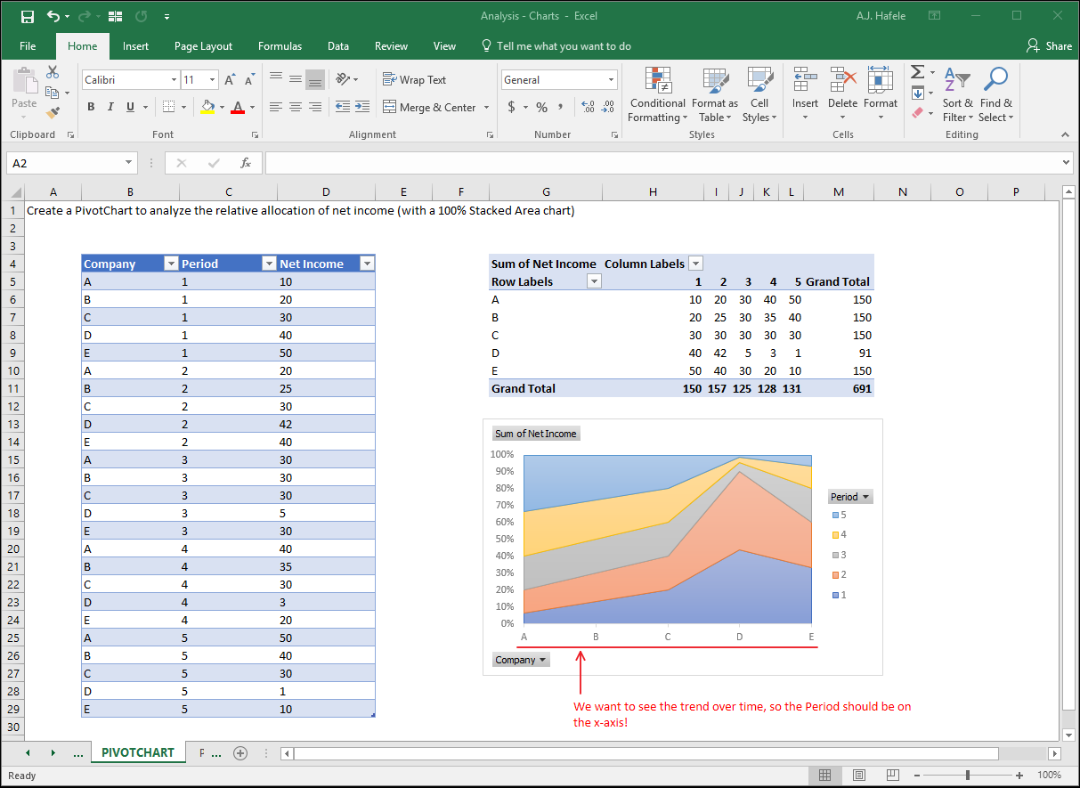
Here’s a screenshot of the results thus far – notice that chart does not yet make any sense:
Now, let’s switch the rows and columns of the PivotTable (and thus the PivotChart) so that the Period is on the x axis, as shown here:
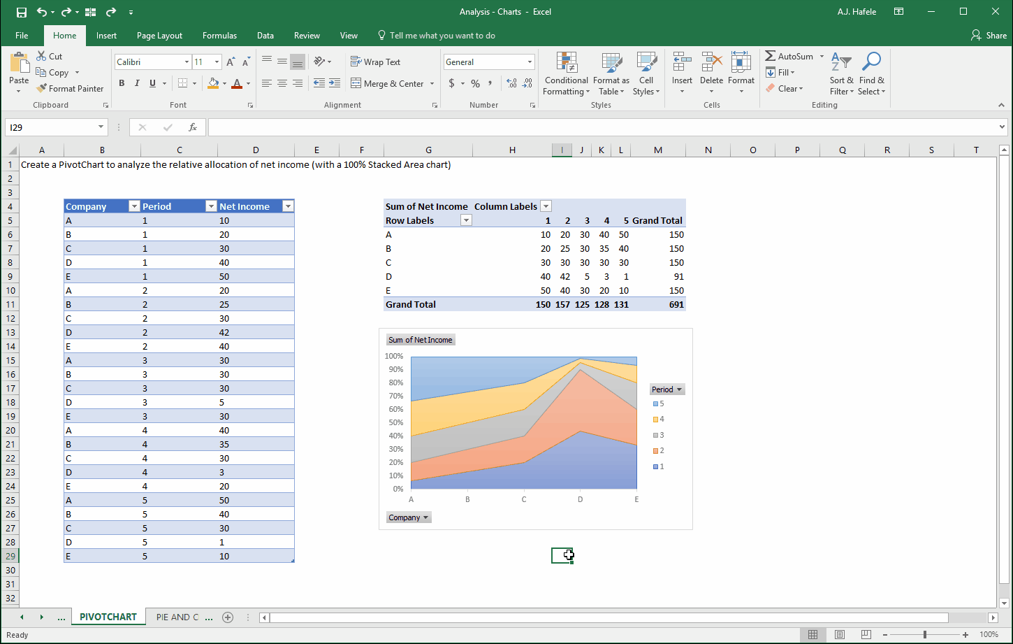
Here is a screenshot of the final result (we added chart and axis titles too):
The chart clearly indicates that Company D’s allocation of total industry net income shrunk significantly, starting in period 3
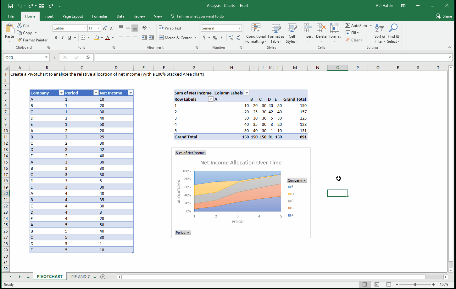
Last, PivotCharts can be filtered as well, as shown here (though not shown, they can also be sorted):
Note that the PivotTable itself could have been filtered instead
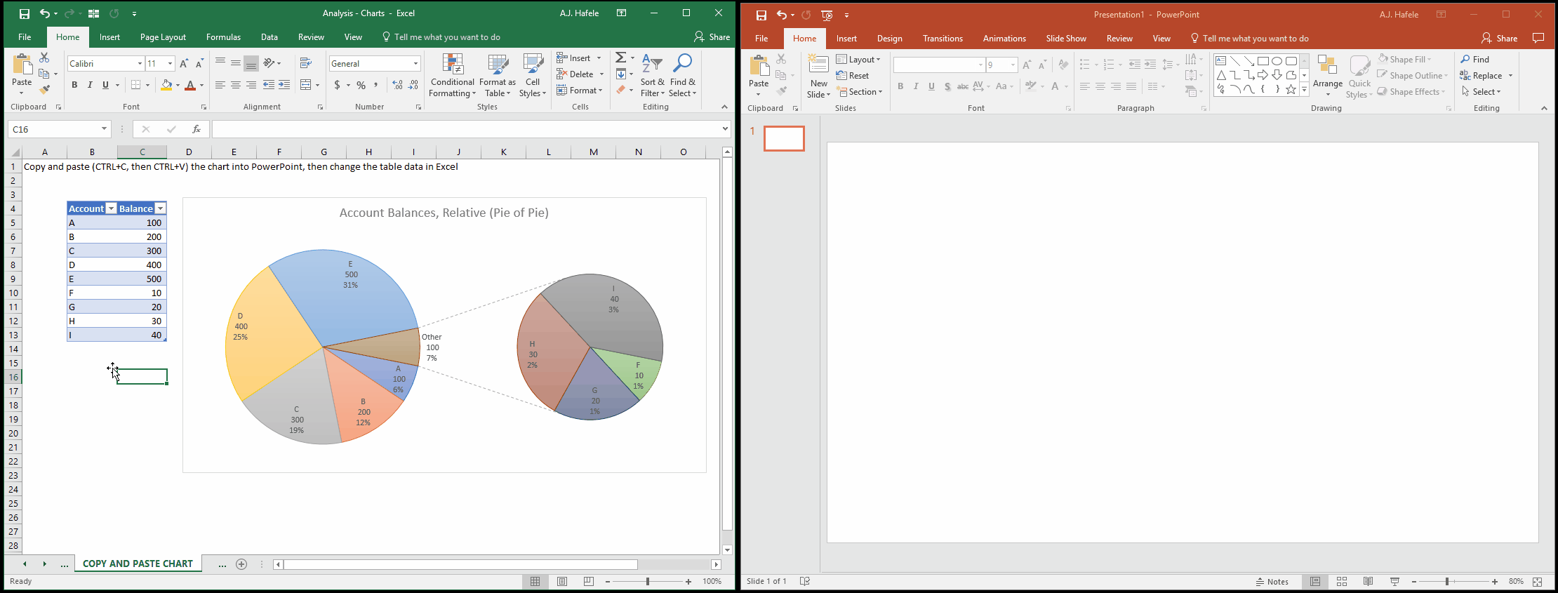
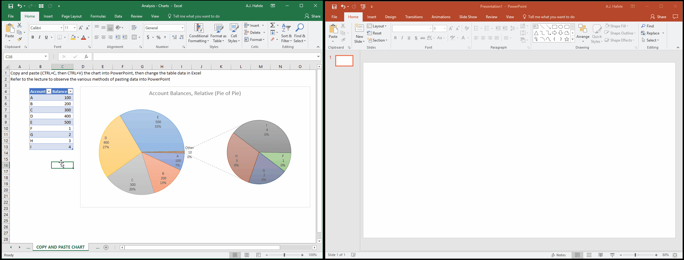
Embedding Charts in PowerPoint
It is often the case that charts are presented to others via PowerPoint
Simply copy and paste the chart from Excel into your PowerPoint to place the chart into PowerPoint
Importantly, a simple copy and paste will effectively link the chart in the PowerPoint presentation to the Excel file, and as such, changing the Excel data will change the chart in PowerPoint:
If this is not desired, paste the chart into PowerPoint and embed the workbook into PowerPoint (rather than link it). This will create a behind-the-scenes workbook within PowerPoint, as shown here:
Finally, you may simply want a picture of your chart, for simplicity (i.e. the chart will not change). You can Paste Special a picture instead, as shown here:
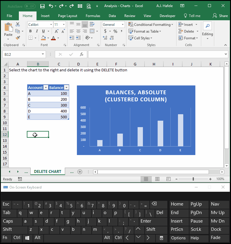
Delete Chart
To delete a chart, simply select it, and press the DELETE button on your keyboard, as shown here:
More Examples
More chart examples can be found in this lecture’s excel file (see the green-colored worksheet tabs)
Chart types, including histograms, scatterplots, and candlestick charts are created for you to examine
Keep in mind the way the underlying data are organized when viewing these examples, for future reference