At this point, we have went through all the major topics surrounding Excel, so you should have an idea of how tables, PivotTables, formulas, etc. work
But how should we approach designing (or constructing) our files?
Though this may seem like a trivial question, it is actually very important
We would argue that document design is one of the most important Excel topics, because document design ultimately determines the efficiency of your work
When designing a workbook, always consider the following two items:
The file's clarity (is the file easy to understand?)
The file's flexibility (will the file accommodate for a wide range of scenarios?)
In this lecture, we will provide some high-level tips for how to construct a clear and flexibile Excel file
Of course, there is no one-size-fits-all approach to Excel, so these tips should be considered with your unique circumstances kept in mind
Be sure to refer to the attached example which illustrates how to implement the methods described below
A brief note: there are no illustrations below - just screenshots
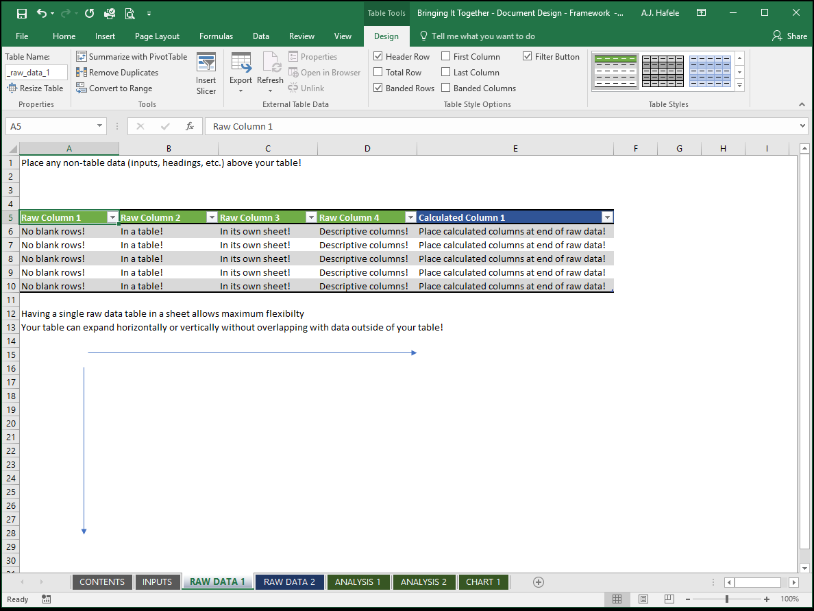
Managing Raw Data
Most often, your analysis with Excel begins with some kind of raw data, whether it is imported from an external source, or maintained within Excel
We recommend handling raw data as follows:
Arrange raw data in a tabular format
Place all raw data in a table
Remember, the benefits of using tables are extensive
Also, for optimal organization, give your tables names! Having relevant names is useful when creating formulas which reference those tables
The same applies to field headers where possible (some raw data extracts may already have headers that you may not want to change)
Never place blank rows in your raw data
This can cause lots of inefficiencies later on down the road
Remember, this is the raw data, not the final output (or report) of your analysis, where blank spaces may be reasonable
Maintain each raw data table in its own worksheet
This is desirable so that your table can have as many rows and columns as possible, without interfering data outside of the table
Remember, we want our file to be flexible!
Place any calculated fields in the rightmost columns of your tables
What do we mean by "calculated" fields? Imagine your raw data (obtained from an external source) consist of 5 fields, but you need a 6th field which is a calculation based on the other 5 (raw) fields. This 6th field is the "calculated" one in this case
Why place these fields on the end? So that you can easily replace the raw data without having to modify your table
Where possible, obtain your raw data from external sources
Ideally, your raw data is initially stored in some kind of database
Try to let that database do all the heavy lifting for you, since databases are better suited than Excel for data entry and storage (particularly when you are working with large quantities of raw data)
Database extracts should (ideally) be used in Excel for analyses and reporting which cannot already be done by the database
Even better, if you can set up linkages from your databases to Excel, you can avoid having to copy and paste raw data into Excel
Here is a screenshot showing the key points with respect to managing raw data:
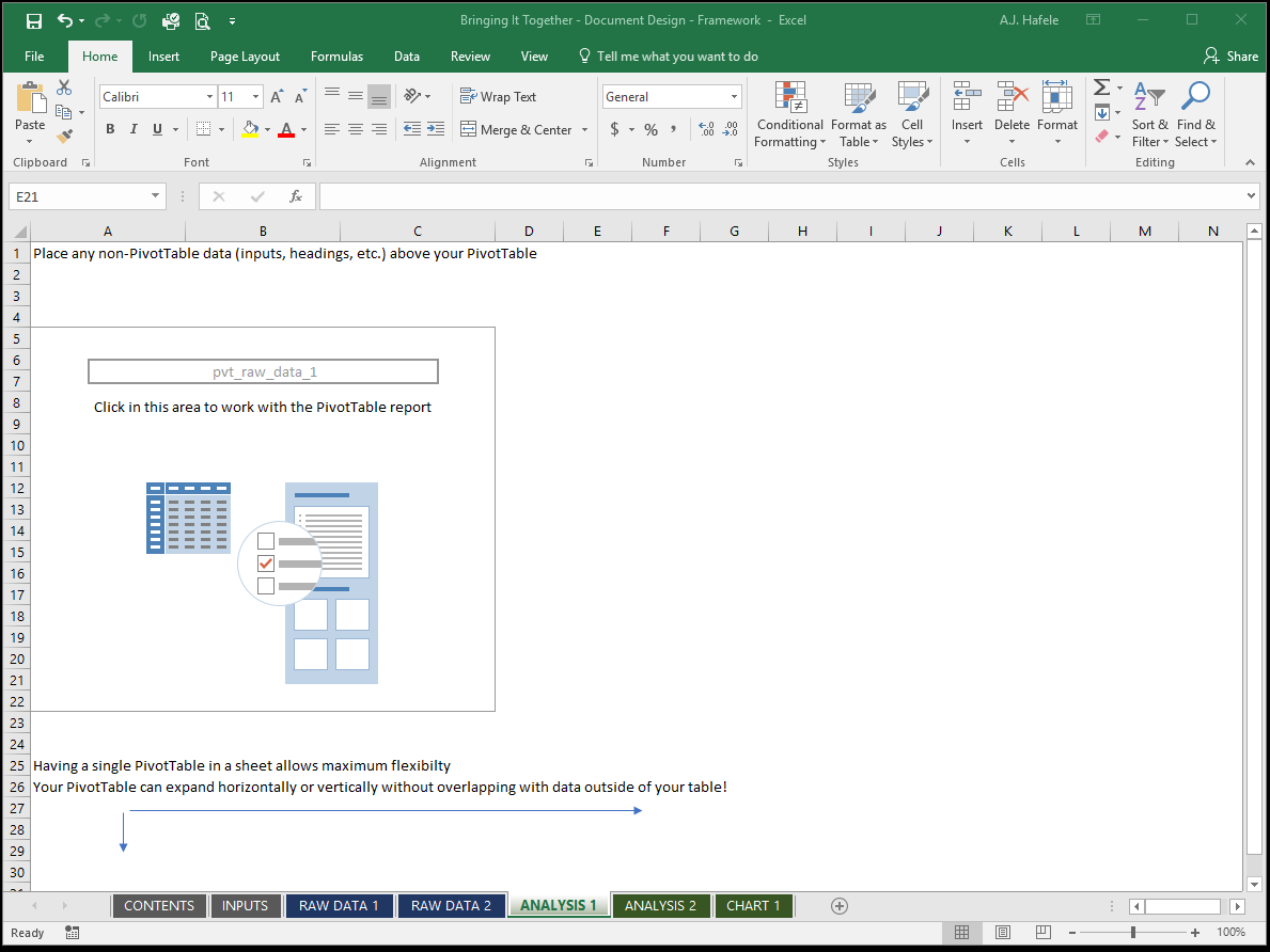
Managing Analyses and Reports
So, your raw data are isolated in their own tables in their own sheets. What about your analyses and reports?
Remember, flexibility and clarity are key
With respect to flexibility:
If you are using a PivotTable to analyze your data, we recommend placing them in their own sheets as well
Once again, the reason for doing so is to prevent your PivotTables from overwriting any other data upon being refreshed
Of course, if you are confident that your PivotTable's dimensions will not change, you could include other analyses in the same sheet as your PivotTable without issue
If your analysis is in a table, then you may also want to place it in its own sheet, to maintain flexibility, as with your raw data tables
Again, however, if your table does not grow in dimensions (rows and columns) it may be safe to include other analyses in the same sheet
If you are not using a PivotTable for your analysis, then use your own judgement in determining whether to place that analysis in its own sheet
With respect to clarity:
First and foremost, ensure that the results of your analyses are easy to understand
Ensure charts are clearly labeled
Use unambiguous headings for rows, columns, fields, etc.
Maintain consistent number and text formats
Clear out any side calculations you may have made (try to avoid these in the first place, or perform them in a separate workbook!)
Do not try to jam too many analyses in a single sheet (there are exceptions, however, such as financial tearsheets)
On the other hand, having one analysis per sheet may result in an overwhelming number of sheets to manage
Thus, try to find a good balance while preserving the flexibility of your file (as described above)
Charts are typically better-suited to be placed in their own sheets
Overall, keep the final consumers in mind when designing your reports / analyses
Here is a screenshot showing the key points with respect to managing a PivotTable analysis / report:
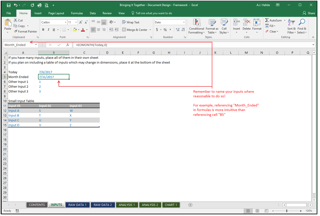
Managing User Inputs
It is often necessary to have a place for user inputs which do not really fit well in tables
For example, your file may require the current day as an input
This only requires a single cell, so a table is overkill
Instead, place the date (or perhaps the TODAY function) in a cell and give the cell a name, such as "Today", so it can be easily referenced throughout the workbook
But where within the workbook should inputs like these be placed?
We recommend placing them in a worksheet dedicated exclusively to inputs
Alternatively, if your inputs are not numerous, consider placing them above (but not below, or beside) your tables or PivotTables
Additionally, try to isolate the inputs so that other users can easily identify them
If inputs are mixed with outputs (or other calculations) others may get confused
The main idea is that the inputs should never get in the way of your raw data or analyses
Here is a screenshot showing the key points with respect to managing user inputs:
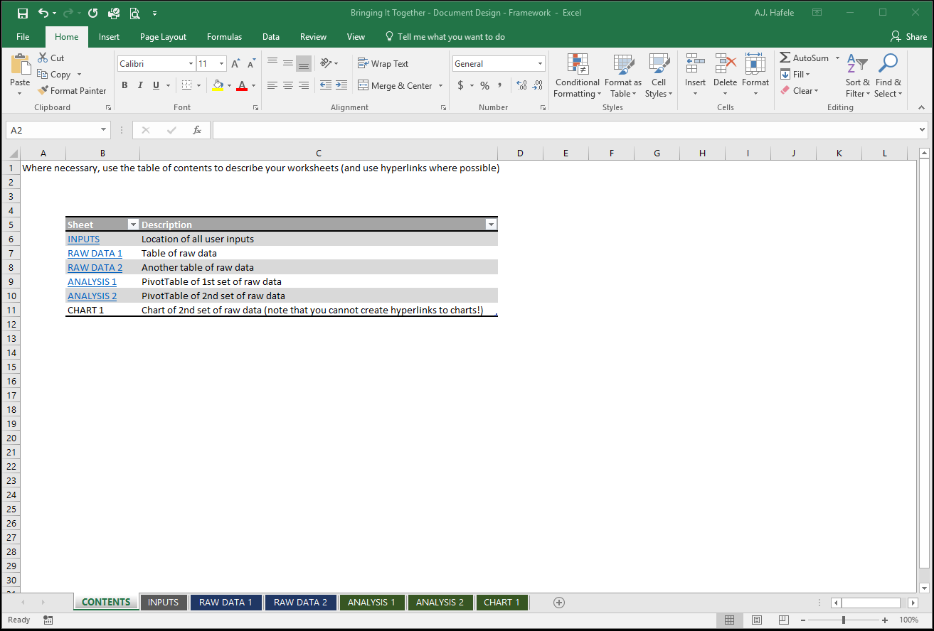
Managing Worksheet Descriptions
How should you identify the contents of your file's worksheets?
There are a number of ways to do this (which are not mutually exclusive)
The first way is to create a table of contents sheet, which provides each sheet name and a description of the contents (and perhaps hyperlinks to the sheets)
Additionally, it is typically useful to give the sheet names themselves relevant names
Another way is to add a descriptor at the top of each sheet
Last, you can opt to insert a header or footer with a sheet description (via Page Layout view), rather than place headers in the sheets themselves
Again, always place the descriptions above PivotTables or tables to avoid overlap
Here is a screenshot illustrating how to manage sheets via a table of contents sheet:
Maintaining Data Consistency
Part of effective document design is ensuring that all your data are as consistent as possible
To do this, remember to minimize having to duplicate the same information
Again, try to maintain master files which can serve as a single source for working files
Additionally, utilize data validation techniques where necessary to restrict what can be entered into cells
For example, if you have a transaction table that requires you to enter account numbers, set up a data validation rule in that field which restricts your options to a master list of accounts
The more consistent your files are, the more versatile your analyses will be
Using Colors
Take advantage of colors when designing your Excel files!
Color code worksheets to effectively group similar sheets
For example, all green sheets are tables, all blue sheets are PivotTables, and all grey sheets are input sheets
Color code fonts to distinguish between the type of data inside each cell
For example, a widely-used color coding convention in financial modeling is as follows:
Blue font: user inputs / hard-coded data
Black font: formulas (within the same sheet)
Green font: formulas (linking to other sheets)
Red font :error
[Side note: conditional formatting can work well for this color coding convention]
Color code tables and PivotTables (again) to group similar data
For example, you can color code a table and all related PivotTables (derived from that table) red
Then you can use another color for another table and set of PivotTables
But, of course, only use coloring where necessary!
Too much color coding can be a very bad thing - it can be overwhelming, and as a result, you can fail at achieving your goal of clarity
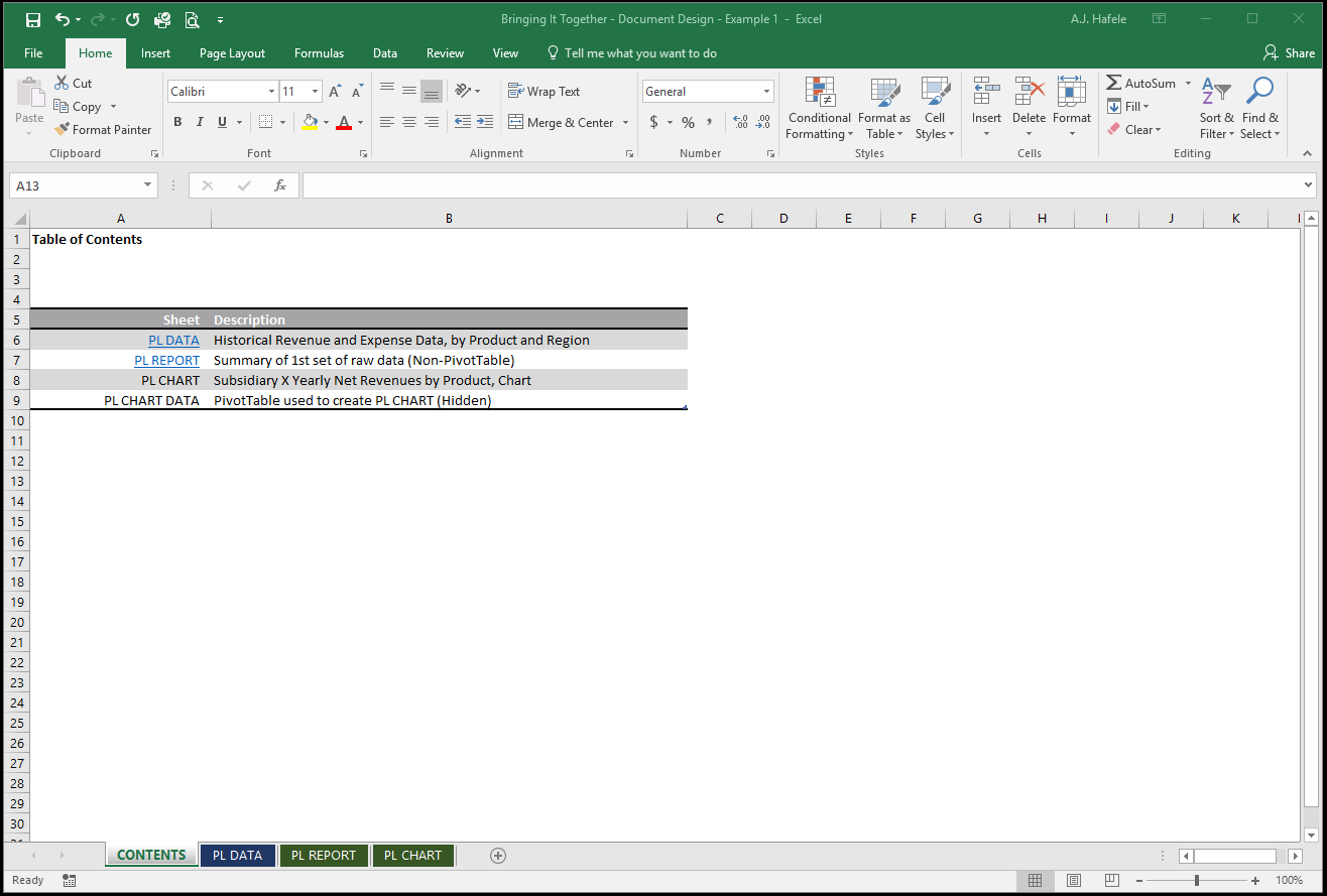
Example 1: PivotTable and PivotChart Analyses
In our first example, our goal is to analyze raw revenue and expense data for a company - we need to present one PivotTable report, and one chart to our team
Observe our setup, starting with a brief table of contents:
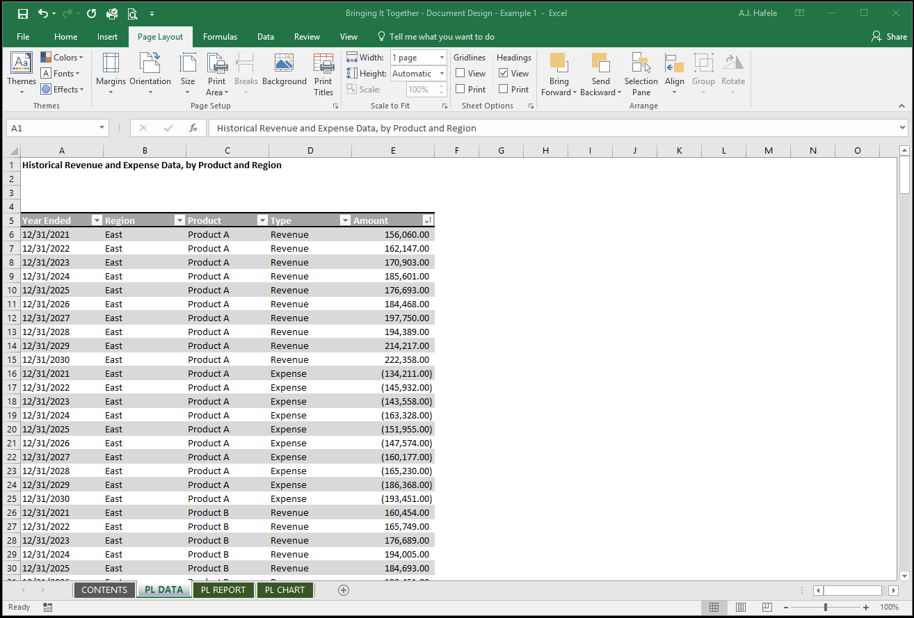
The PL DATA tab only contains the raw data we will use in our analysis:
Note that:
A table is used in order to ensure our final PivotTables always capture all data
A heading was placed above the table
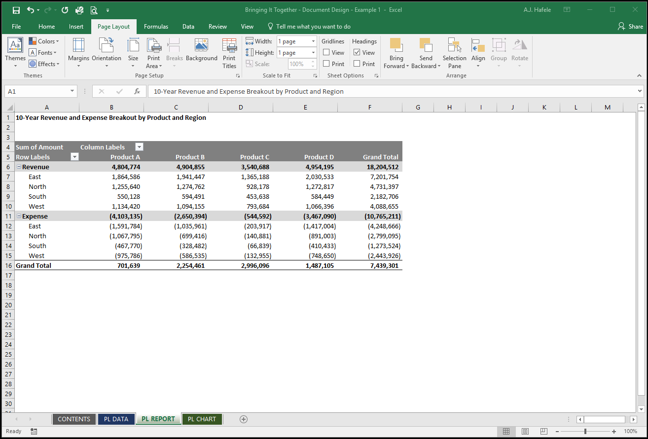
The PL REPORT tab holds our first analysis / report, which is a PivotTable based on the table above:
Note that:
Only the PivotTable is in this sheet, which provides both flexibility and clarity
A description is placed above the PivotTable (we just have to be careful if we decide to add filters later!)
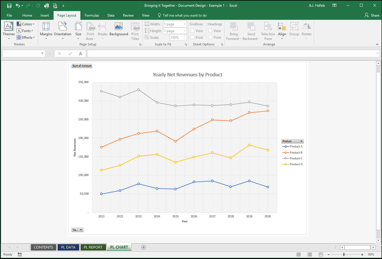
The PL Chart tab contains a PivotChart, ultimately based on the same exact raw data:
Note that:
The underlying PivotTable is hidden, since we do not need to see the same analysis twice!
Example 2: Non-PivotTable Analysis
In our second example, our goal is to create a balance sheet from a table of raw data
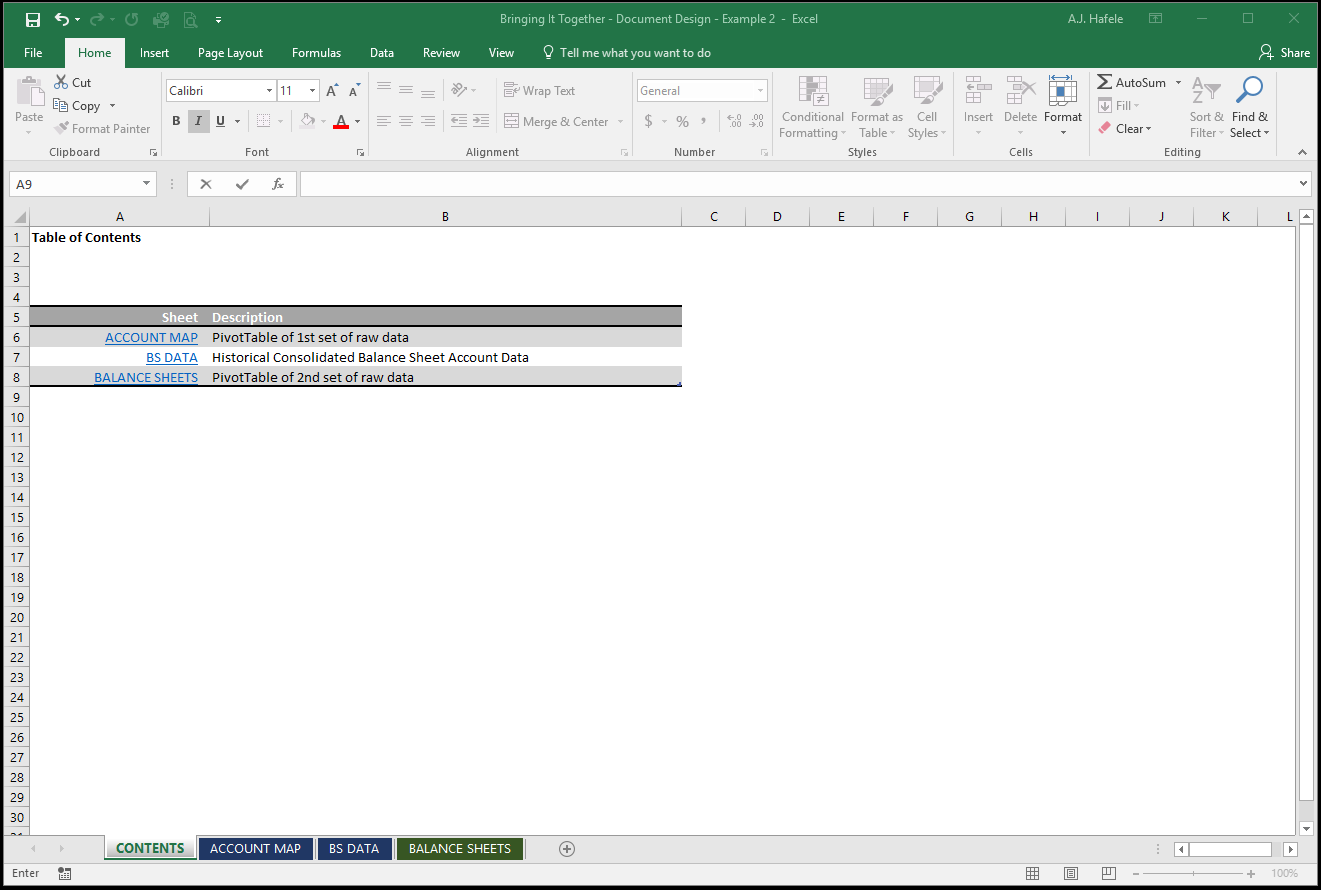
Observe our setup, starting with a brief table of contents:
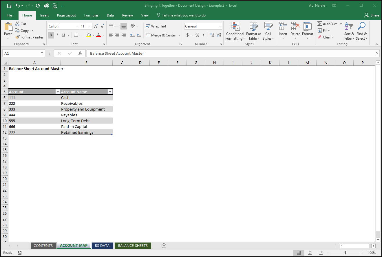
The ACCOUNT MAP tab only contains a list of accounts that will be used to map account numbers to balance sheet items (for our final report):
Note that:
Ideally, this table would be linked to a master table of accounts!
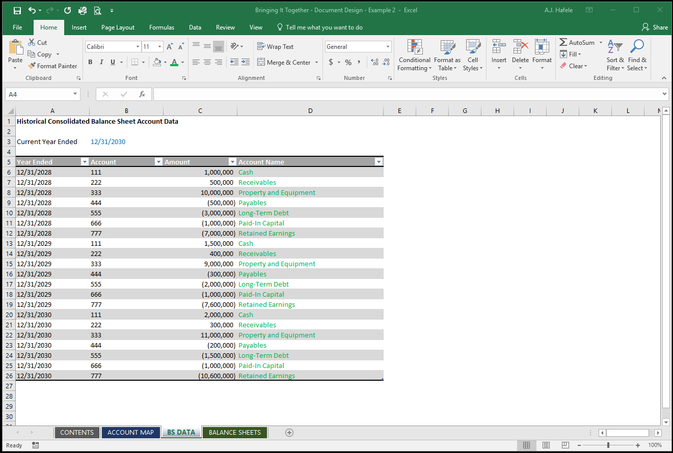
The BS DATA tab only contains a table of data that we will use to create our balance sheets:
Note that:
We only have a single table in the sheet to provide us with maximum flexibility (we can add more years worth of data without the table bumping into something)
Column D has a field that contains a formula which links to the table in the ACCOUNT MAP sheet (hence the green font!)
We have a user input, which is the current year ended in cell B3, named "Year_Ended"; this will be referenced in the final report
Since this is our only input, an entire sheet dedicated to inputs was unnecessary
A PivotTable cannot provide us with the format necessary to present a balance sheet, so we had to create our own
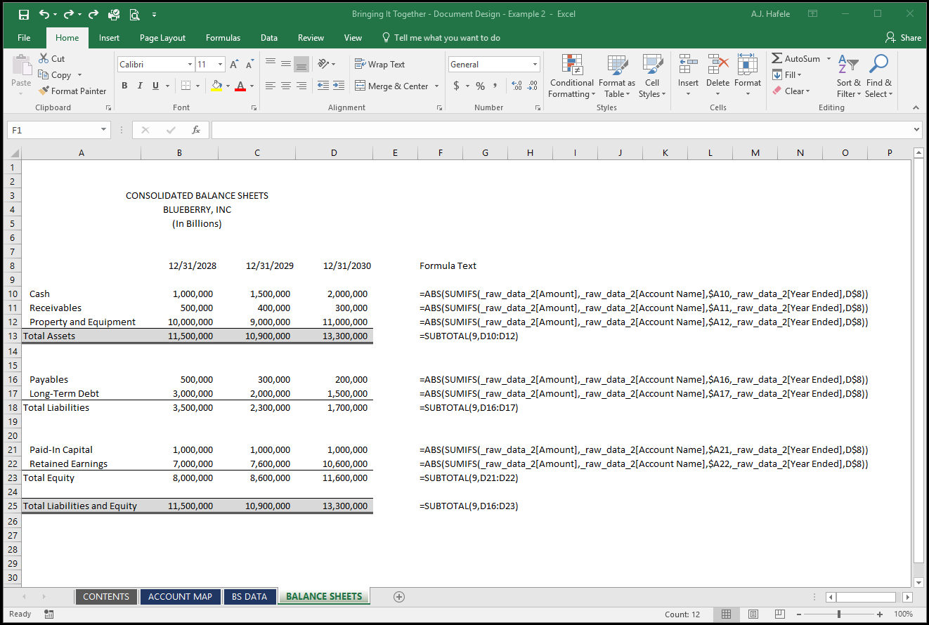
The BALANCE SHEETS tab contains our final report - our balance sheets (with formulas shown for reference):
Note that:
Although not shown, Cell D8's formula is =Year_Ended, and Cells C8 and B8 use EOMONTH to go back 1 and 2 years, respectively
The data (except the SUBTOTAL figures) are all derived from the table using a single, simple SUMIFS function which was copied and pasted to all relevant rows and columns
Since this is a final report, we did not want to color code any numbers in this sheet
Importantly, leveraging raw data formatted in a table allows us to easily use this workbook for future periods (all we need to do is replace the raw data and update the Year_Ended input!)